As Senior Product Designer for KOBAJ's new travel app it was my job to create and execute a UI/UX process for the newly started project while collaborating with relevant stakeholders such as the CTO, CCO and CEO. The process I followed was based on design thinking principles and looked something like this:

Project Brief
The project brief outlines a clear and ambitious goal: to develop a working prototype within the next
three months, and be ready to build it with the developers and get it ready for testing and deployment
within a year.
 This time-sensitive objective requires a focused and efficient approach, prioritizing rapid ideation,
prototyping, and user testing to ensure the product's viability. Close collaboration between the UX
design and development teams will be essential to meet this tight deadline and deliver a successful and
user-friendly solution.
This time-sensitive objective requires a focused and efficient approach, prioritizing rapid ideation,
prototyping, and user testing to ensure the product's viability. Close collaboration between the UX
design and development teams will be essential to meet this tight deadline and deliver a successful and
user-friendly solution.
Research
In the research phase, I conducted a comprehensive user survey using Survey Monkey, involving 850
engaged KOBAJ users. To ensure a well-rounded dataset, I additionally arranged 8 in-depth interviews
with some of our most devoted customers, who were among the users who had requested the option to visit
wineries.
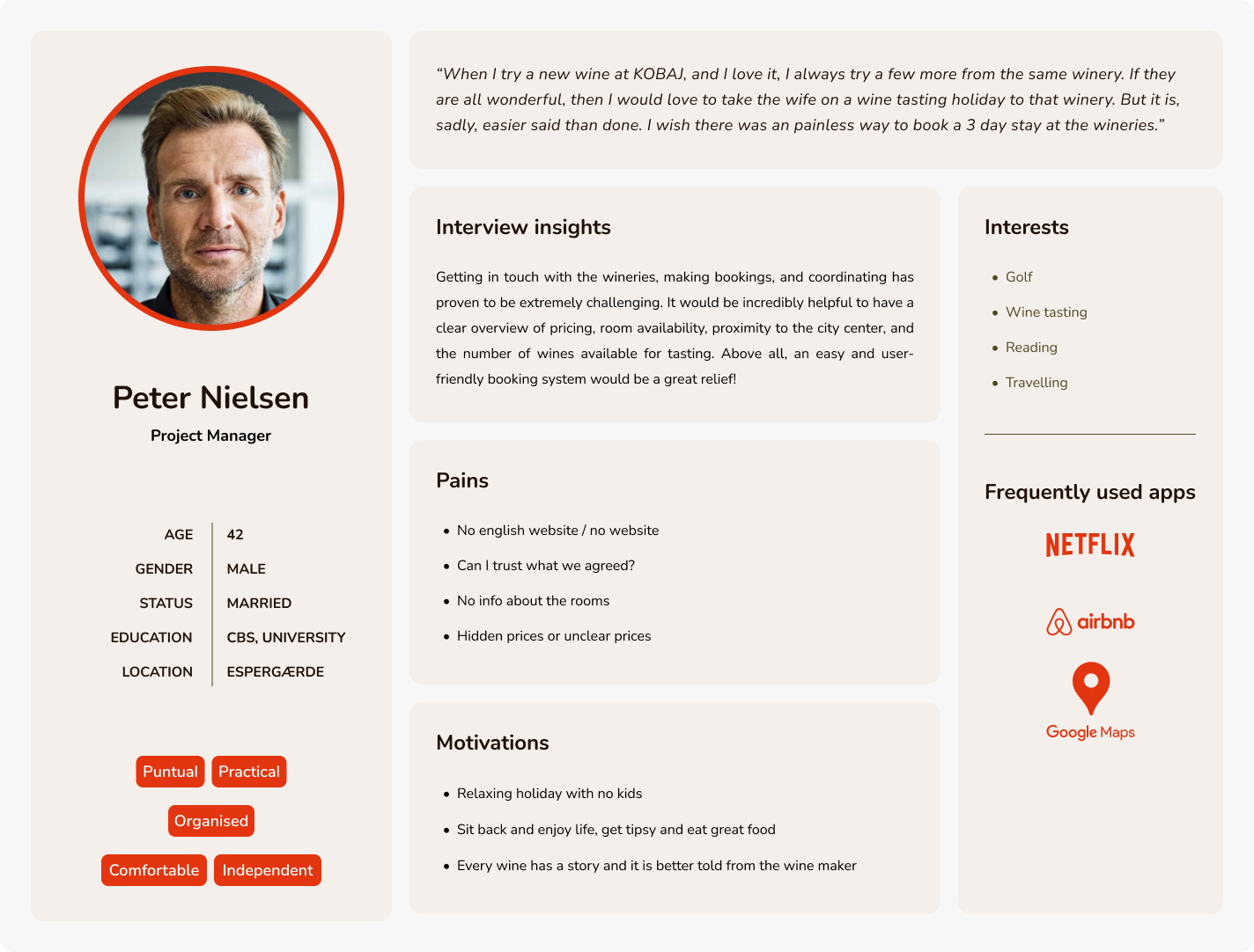 In-depth interviews were a goldmine in terms of insights.
Google Analytics was another usefull tool to understand the average user persona, and Customer Service
was a huge help in gaining insights into customer pain points and areas of satisfaction.
Everyone's remarkable enthusiasm and eagerness to contribute were not only inspiring but also pivotal in
propelling our next steps forward.
In-depth interviews were a goldmine in terms of insights.
Google Analytics was another usefull tool to understand the average user persona, and Customer Service
was a huge help in gaining insights into customer pain points and areas of satisfaction.
Everyone's remarkable enthusiasm and eagerness to contribute were not only inspiring but also pivotal in
propelling our next steps forward.
Brain Storming
I was actively involved in the brainstorming sessions, and I can attest to how much they propelled our
project forward. Brainstorming brought together diverse perspectives and creative ideas from the team.
It helped us explore different design concepts and solutions, ultimately leading to innovative
approaches we might not have considered individually.
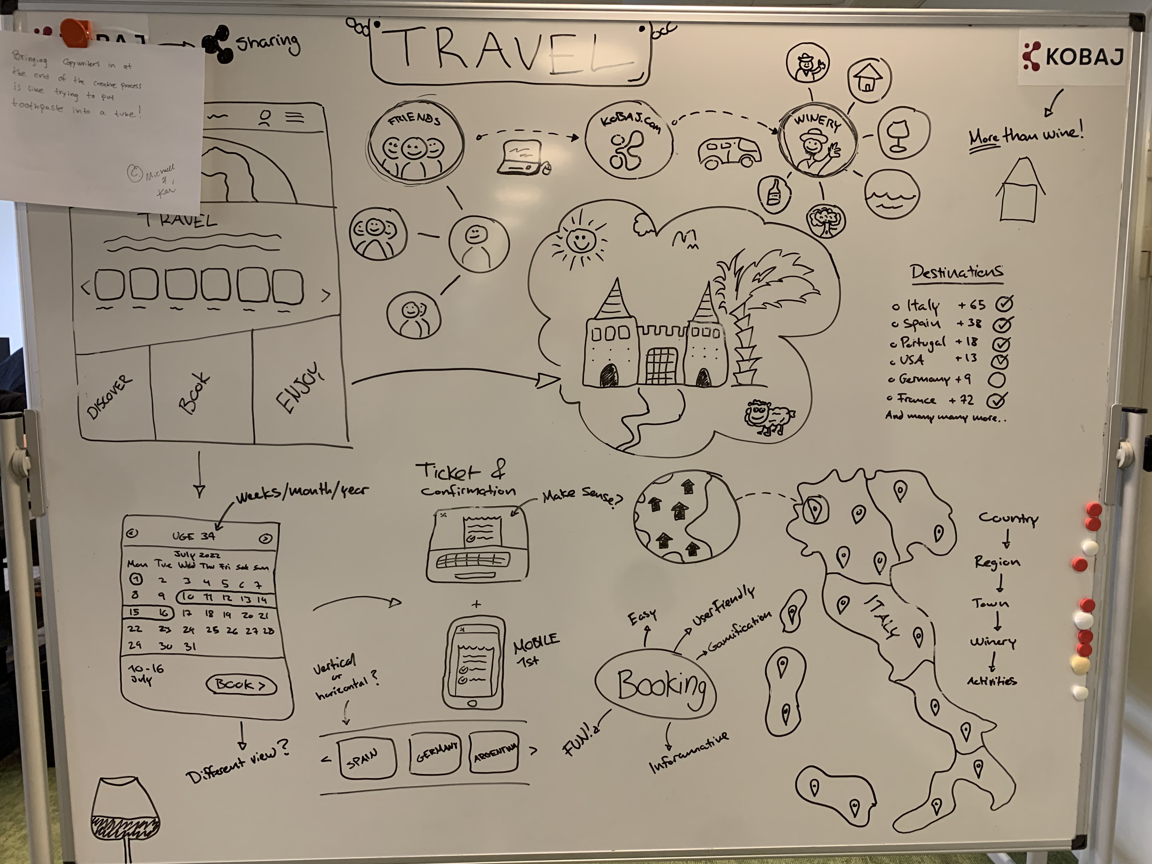 One of many brainstorming sessions
The collaborative atmosphere fostered during brainstorming encouraged open communication and
problem-solving, which was invaluable in shaping the project and making it more user-centric.
One of many brainstorming sessions
The collaborative atmosphere fostered during brainstorming encouraged open communication and
problem-solving, which was invaluable in shaping the project and making it more user-centric.
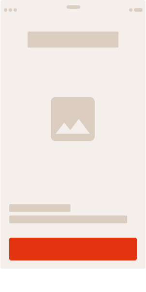
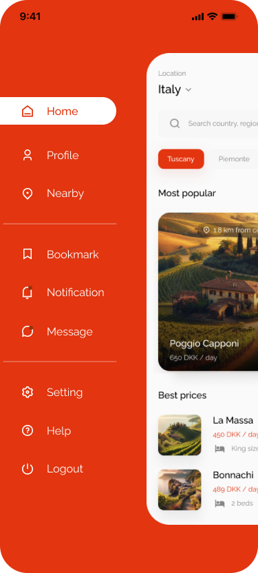
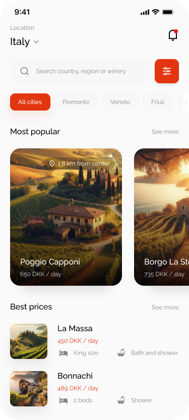
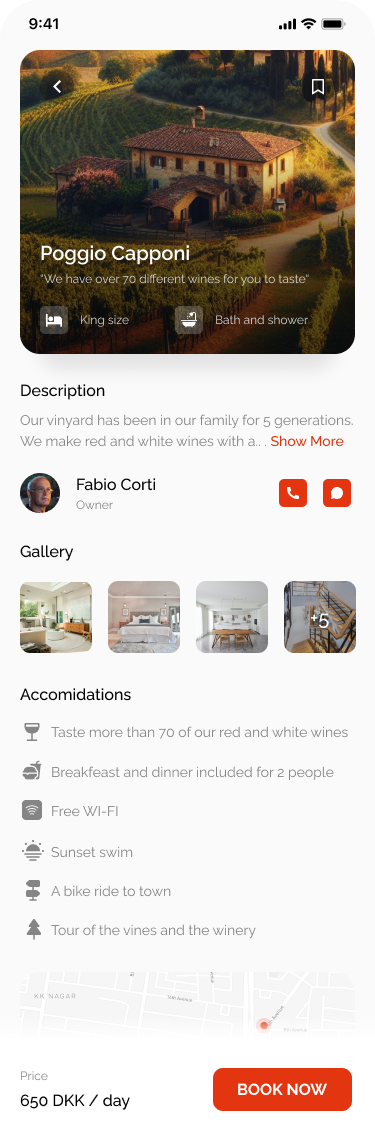
Wireframing & Rapid Prototyping
After creating a comprehensive set of common wireframing design elements, we were ready to organize the valuable insights we had gathered. To streamline the process, I initiated a Rapid Prototyping session involving fellow creatives and stakeholders. In just a matter of days, we had developed a low-fidelity clickable prototype using InVision.