CORPORATE IDENTITY

Getting past an identity crisis

In my +12 years of being a digital designer, I have come across quite a few great oppertunitites to help brands find their true spirit animal. These are some of the ones I am pretty proud of.

EXP is an all-encompassing e-sports platform offering services such as booking e-sport events, reserving tables at local internet cafes, and purchasing skins for the newest AAA games. For the logo, I aimed to encapsulate the essence of e-sports by utilizing clean, straight lines and a subtly sci-fi appearance. The logo reflects these qualities, symbolizing the fusion of technology and gaming inherent in the e-sports world.

I also made an animated version of it which was used for loading screens.


KEYCORE is an AWS cloud solutions consultancy, who needed a modern take on their branding strategy, and hired me to assist them. When hand crafting their logo i felt it was very important to let the logo tell a story about who they are as a company.

The mechanical cogwheels inside the cloud sets the scene for a company to understand what drives the cloud and its many components.

I also came up with the payoff "AWS Solution Specialists", becuase KEYCORE is a highly specialised company with a sole focus on AWS clud solutions. This helps anyone interacting with the identity to decode their business immediatly.

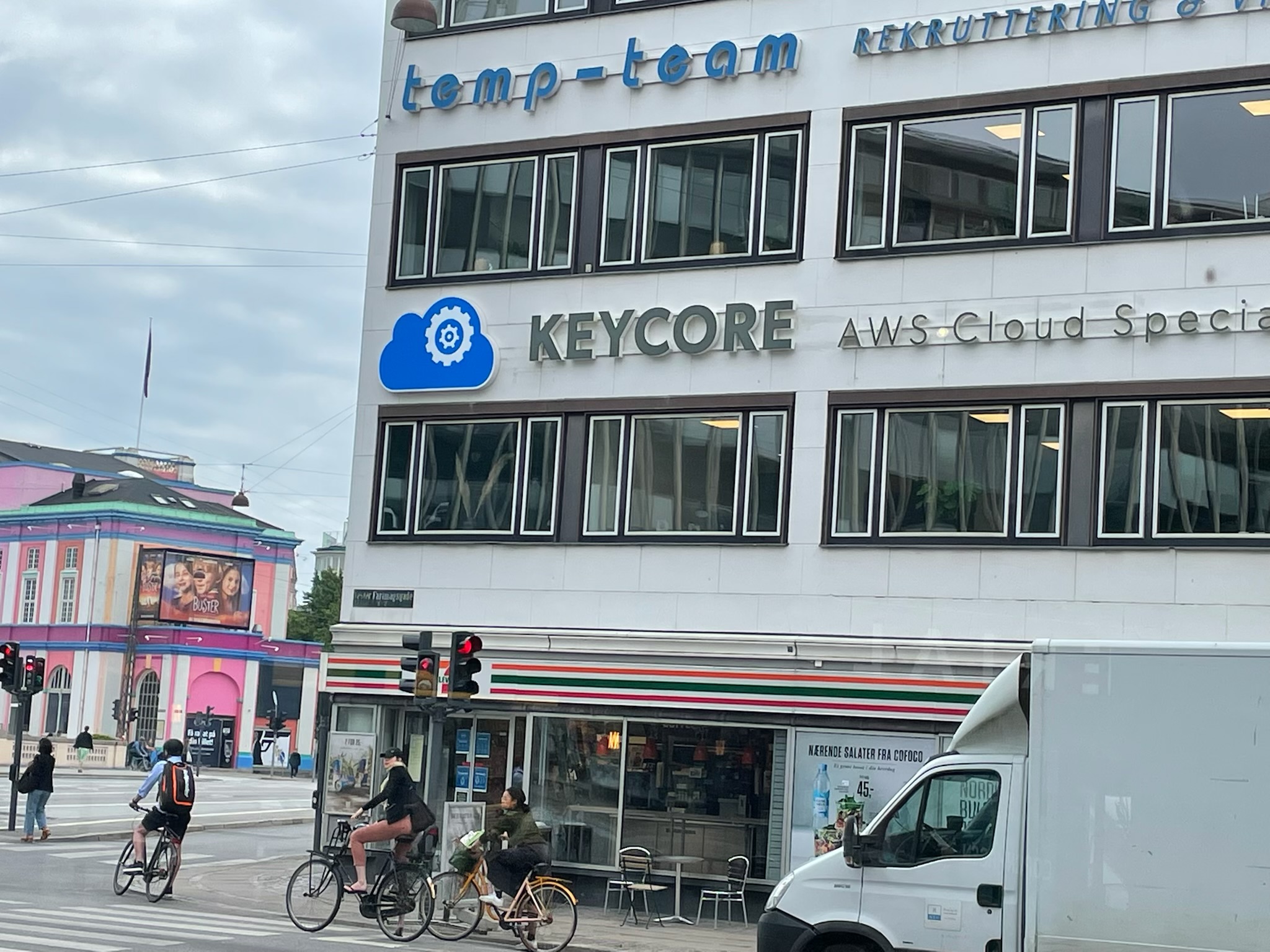
The KEYCORE logo in all its might and glory

Wonder Wear is a slimming clothing brand that uses tight fitting fabrics to hide those extra kilos. The two Ws in the logo represents a woman's legs before and after using Wonder Wear.

I also came up with the pay-off "Made for everybody" highlighting the word body. A fun and clever way to say that anybody can use it and it fits all body types.


Ridgecrest Strategic Capital desired a simple, but powerful and sophisticated logo. They loved the idea of an owl, which symbolises wisdom and cunning.


Nord Anlæg is a landscaping company, that required a new logo. The tree element symbolizes landscaping, while also doubling as an arrow pointing north. A play upon the name of the company and what they do.


JJ Built Utilities & Excavation needed a masculine logo which conveyed a lot of power. This is the result.


BACK TO TOP