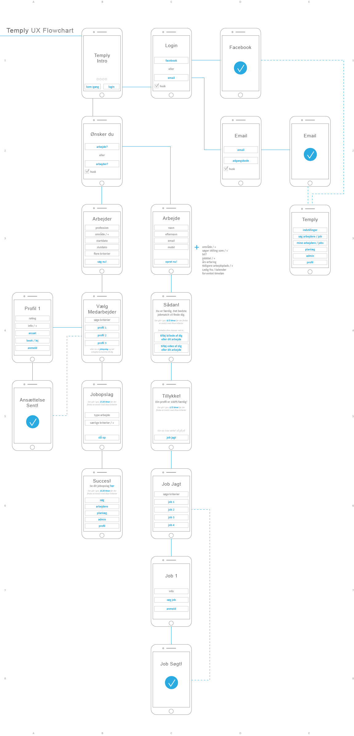
Bringing Ideas to Life
After setting up the wireframes, I began crafting the high-fidelity prototype. This version would be
pivotal in conducting usability tests and gathering valuable feedback from actual users. It aimed to
uncover potential issues, grasp user behavior, and validate our design choices. Our goal was to create
an interface that was clean, easy to use, and exuded a modern, cutting-edge vibe.
Just tap or hover, to enlarge the image
At that time, flat design, gradients, and simplicity were all the rage. So, I made it a point to lean
into that trend while working on the design direction.
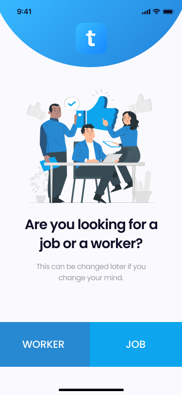
To save time, we opted to outsource the logo design. This logo was then incorporated into both the
loading page and the onboarding screens ensuring consistent brand recognition.
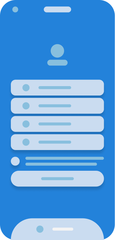
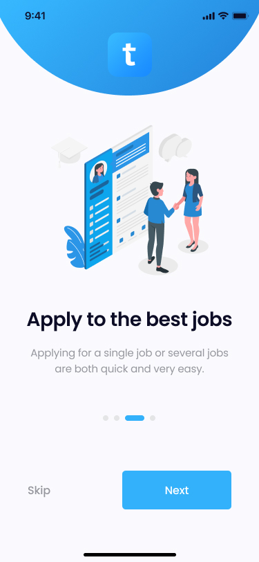
The initial screen prompts users to choose between seeking a job or hiring a worker. Clarity was
paramount here, as a mistaken click could lead to a confusing user journey.
The deliberate selection of "job" or "worker" wording aimed to avoid confusion. Using "work" or "worker"
might have caused inadvertent clicks, resulting in a subpar user experience.
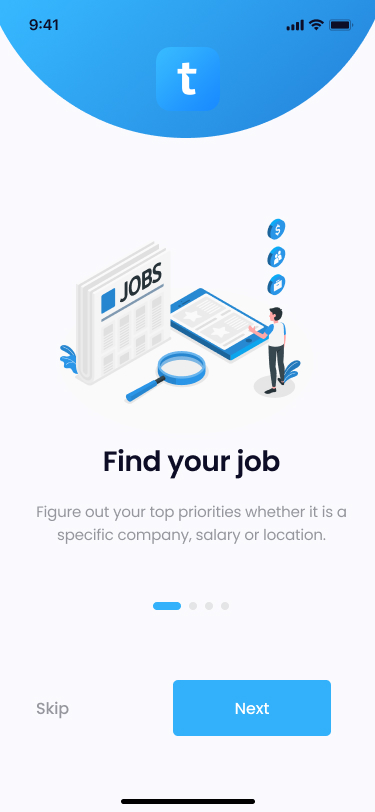
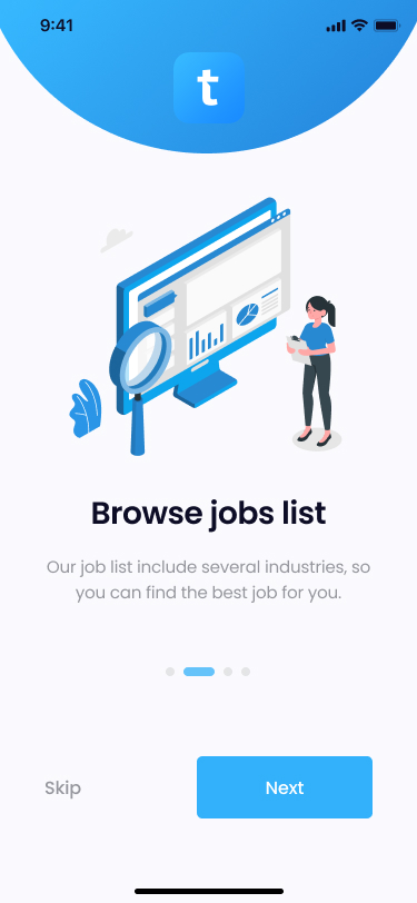
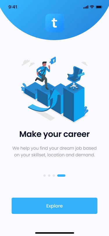
During that period, the buzz around town was all about flat design and minimalistic animations. To
capture this trend, I crafted a graphical universe for Temply using these illustrations. They proved
incredibly useful in conveying messages and transforming a simple, minimalist design from mundane to
captivating.
Given that blue was our primary brand color, incorporating various shades of blue was a natural choice.
To enhance depth, I introduced light gray tones for the background elements as well.
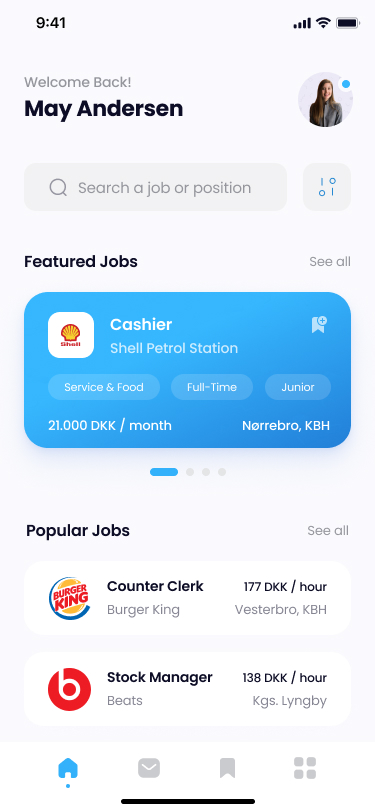
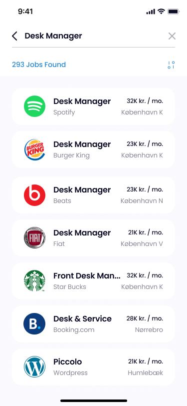
The explore page showcases two types of jobs: the 'featured jobs' with a prominent top position,
intended as a paid promotion for companies with a larger spending budget.
The second type comprises the 'regular jobs', positioned below the paid promotions. These listings are
sorted based on popularity, relevance to search/profile criteria, and location. Each job appears in
various categories, determined by data, such as 'popular jobs', 'new jobs', and 'best-paid jobs'.
Post-launch, we maintained a keen focus on the performance of each category, engaging in A/B testing.
This approach aided us in assessing whether the category placement was optimal in comparison to others
and if any naming adjustments were necessary. Additionally, it provided an avenue for experimenting with
new categories and refining the 'featured jobs' section.
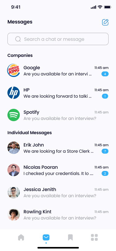
Throughout a job search, ample communication occurs between job seekers and providers. To centralize
this within the app, we developed a messaging feed feature. This functionality empowered users to
conveniently track and manage all their communications within the platform.
The page was divided into two distinct categories: one for companies and another for recruiters and HR
personnel who hadn't yet established a company profile.
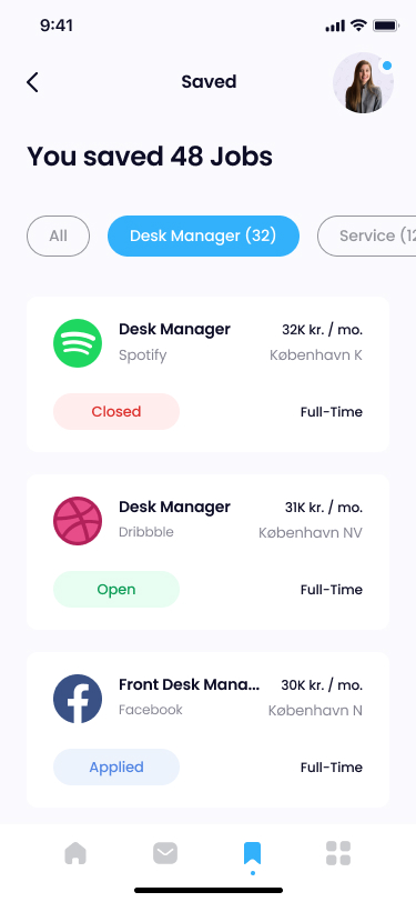
When on the job hunt, having the ability to save intriguing opportunities is crucial. That's precisely
what the favorites page accomplished—it allowed users to save jobs of interest, eliminating the
need to apply immediately or search for them later.
A simple filtering system enabled users to refine job types, while the job status feature facilitated
tracking of applied jobs and their current availability status. This streamlined the process of managing
applications effectively.
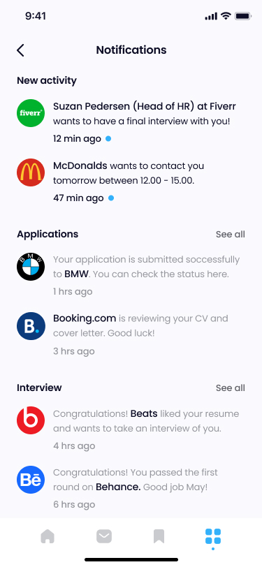
The notifications tab provided users with a comprehensive overview of all activities related to
applications, interview requests, and general job updates.
The concept aimed to emulate a personal job assistant through this page, offering encouragement to users
in their pursuit of their dream job. Phrases like 'Good luck!' and 'Good job May!' were strategically
included to motivate users and hopefully bring a smile to their face.
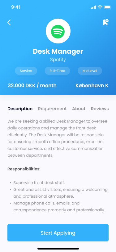
The job description page serves as the platform for the company to shine. Here, the
'description', 'requirements', and 'about' sections are crafted by the company, placing the
responsibility on them to include all pertinent and relevant information.
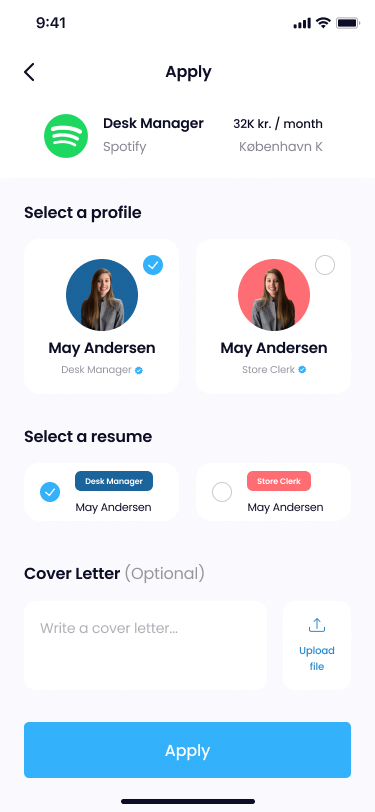
When a user begins the job application process, our aim was to make it as hassle-free as
possible. The functionality to create multiple profiles, CVs, and cover letters allowed users to save
them for future use. Once created, these profiles and documents could be conveniently reused when
applying for similar types of jobs, streamlining the application process.
This streamlined process meant that applying for a new job could potentially be accomplished in just 5
clicks or even fewer.
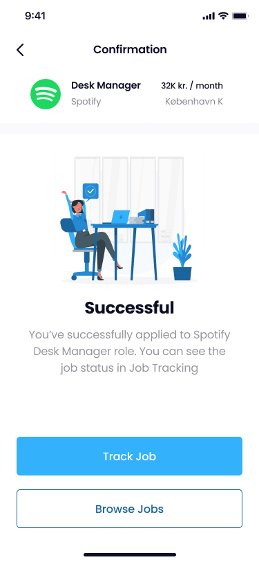
Upon successful completion of the application, users are directed to the confirmation page. Here,
applicants can track the job status to stay updated or seamlessly return to job browsing, ensuring they
stay informed and connected throughout the process.
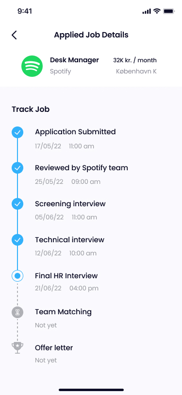
Following the application submission, the job is automatically added to the user's 'favorites' tab. This
feature allows users to conveniently track the job status whenever they desire, ensuring easy
access to monitor their applications.
Similar to tracking a parcel delivery, this feature provides users with a comprehensive view of the
company's hiring process and the applicant's current stage within it. Notifications are triggered to
update users whenever the company progresses in the hiring process, ensuring they remain informed about
their application status.
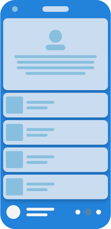
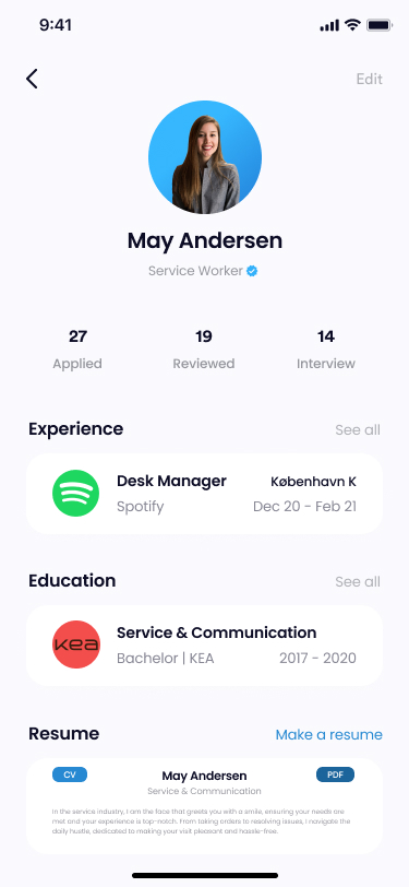
The overview tab allows users to manage various aspects such as adding personal information,
modifying or adding applications, incorporating a portfolio, and adjusting general settings like light
mode/dark mode preferences and notification settings. It serves as a centralized space for user
management and customization.
The inclusion of the 'premium' button was a forward-looking feature, envisioned for potential future
use. It aimed to offer users the opportunity to pay a nominal fee and access specific advantages while
applying for jobs. For instance, this could involve assistance from a Temply recruitment specialist,
providing advice and personally reaching out to companies on the user's behalf.
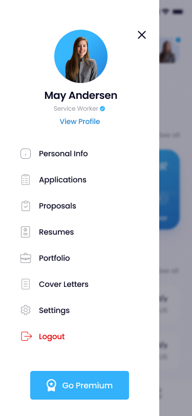
Within the view profile section, users have access to relevant statistics and the option to add
details regarding their experience and education. Additionally, users can include a comprehensive CV and
craft a brief bio for companies to peruse, providing a holistic view of their professional background
and skills.
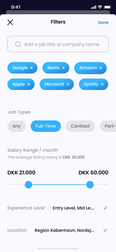
The filtering feature empowered users to refine their job search by applying specific parameters
such as company names, job types, salary ranges, experience levels, and more, streamlining their search
results to match their preferences accurately.
Selecting a 'part-time' job adjusts the salary range to an hourly rate, while choosing 'any' job type
adds an extra slider for hourly rates.
The search function presents a straightforward summary of items matching the search criteria.
Although subject to potential logic changes via A/B testing, the initial setup showcases results based
on search query accuracy, followed by sorting according to salary. During our interviews, salary emerged
as the primary parameter of interest for users, followed closely by location.
In testing the final prototype from the users' viewpoint, I employed InVision Lookback, a cutting-edge
mobile user testing tool at that time. This innovative tool facilitated the creation of a think-out-loud
test directly from the user's iPhone. It recorded their interactions, displayed their facial
expressions, and captured their voice, providing comprehensive insights during testing sessions.
All it required was a phone number, enabling me to utilize InVision to send a text message containing a
link to the prototype. This approach allowed us to potentially recruit individuals from around the
world, enabling us to conduct prototype tests and store their responses for subsequent analysis.
For instance, when testing the search function, I'd generate various tasks for the user to execute while
prompting them to comment directly on their iPhone. Subsequently, I'd save the recorded videos
categorized under 'Search function' and compile all the findings from that particular user test at a
convenient time for further analysis.
A proud success story
The Temply app's launch on the App Store has been a tremendous success, currently ranking at #48 in the
'Business' category with a commendable 4/5 rating. While I've embarked on new challenges since then,
this project remains incredibly close to my heart, and I take immense pride in the journey and success
it has achieved. It's a project I hold in high regard and am exceptionally proud of!
 Iteration is key when gaining new insights during the design thinking process
 Understanding the challenges users face is a crucial step in identifying how to alleviate their
difficulties. These insights served as a valuable guide, prompting us to brainstorm potential features
that could effectively turn their pains into gains.
Understanding the challenges users face is a crucial step in identifying how to alleviate their
difficulties. These insights served as a valuable guide, prompting us to brainstorm potential features
that could effectively turn their pains into gains.